











Creating a Stunning Blog Design: Themes and Customization requires selecting a lightweight, mobile-responsive theme. You can customize typography, color schemes, and layout structures to fit your brand identity. Balancing aesthetic appeal with clean navigation and fast loading times transforms a generic template into a cohesive, readable space that establishes immediate credibility.
The rest of this guide outlines essential technical criteria for evaluating themes, compares free and premium options, and provides a sequential process for brand customization. It also covers user experience strategies to improve scannability and common design mistakes to avoid.
Creating a Stunning Blog Design: Themes and Customization
Creating a stunning blog design requires selecting a lightweight, mobile-responsive theme. You can customize typography, color schemes, and layout structures to fit your brand identity. By balancing aesthetic appeal with clean navigation and fast page loading times, you transform a generic template into a cohesive, readable, and highly engaging digital space.
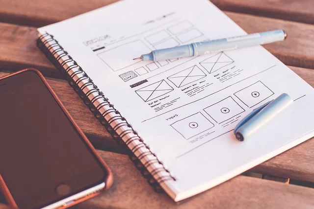
Your choice of design directly dictates how readers evaluate your content’s credibility within seconds of landing on your page. A visual art or photography blog requires an image-heavy, grid-based layout with generous whitespace. However, a technical blog relies on structured typography, code snippet blocks, and clear sidebar categorizations.
How do you choose the right theme for your blog?
Selecting a blog theme sets the technical foundation for your entire site. Beyond aesthetic layout, your theme dictates how efficiently pages render and how easily search engines index your content. Also, it controls how effectively your site scales as your traffic grows.

When evaluating candidate themes, review these core technical criteria:
- Mobile Responsiveness: The theme must adapt fluidly across mobile, tablet, and desktop viewports without broken text boxes or horizontal scrolling. According to HubSpot’s 2025 Digital Marketing Report, over 50% of web traffic comes from mobile devices, making responsiveness non-negotiable.
- Code Efficiency: Avoid themes bloated with pre-packaged sliders and dozens of third-party script requests. Themes built with lean code load significantly faster and reduce server load.
- Plugin Compatibility: Ensure full compatibility with essential tools such as search engine optimization utilities, caching mechanisms, security tools, and form builders.
- Accessibility Compliance: Look for themes designed around Web Content Accessibility Guidelines (WCAG), offering built-in keyboard browsing support and clear screen reader tags.
Generic multi-purpose themes are often poorly suited for long-form publishing. If your blog focuses primarily on written content, heavy visual builders bundled with these themes add unnecessary script overhead. As a result, this slows down mobile devices.
Should you use a free or premium theme?
The choice between a free and a premium theme depends on your long-term goals, customization requirements, and technical capabilities. Free themes available in official platform repositories provide a functional starting point for hobbyists or individuals testing a new project. They offer basic styling controls and standard page layouts without financial investment.
However, free themes often lack advanced customization panels, dedicated support, and frequent security updates. If you plan to build an audience or commercialize your site, investing in a stunning and professional blog design through a premium theme provider is usually the better path. Premium themes such as Astra or GeneratePress provide extensive layout controls, modular code bases, and fast execution without requiring code edits.

| Feature | Free Themes | Premium Themes (e.g., Astra, GeneratePress) |
|---|---|---|
| Customization Depth | Basic options limited to primary colors and header logo uploads. | Full control over typography, container widths, layout hooks, and element spacing. |
| Page Load Performance | Varies widely; can contain unoptimized asset scripts. | Optimized modular code built for minimal HTTP requests. |
| Support and Updates | Community forums only; updates depend on volunteer maintainers. | Dedicated support teams and regular updates for bug fixes and core software compatibility. |
| SEO and Schema Markup | Basic HTML structure without detailed schema customization options. | Built-in schema integration options and clean HTML structural markup. |
How do you customize your theme to match your brand?
Customization transforms a default theme into a distinct brand platform. While pre-built layouts give you a starting framework, customizing visual elements ensures your site looks intentional rather than templated.
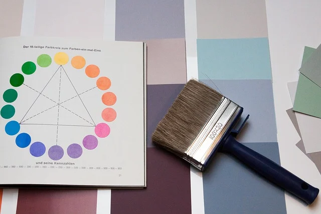
Follow this sequential process to customize your theme effectively:
- Establish a Typography Hierarchy: Select a maximum of two complimentary font families. Use a clean sans-serif font like Open Sans or Lato for body copy (16px to 18px font size for comfortable reading), paired with a distinct serif or bold sans-serif font for headings. Maintain a consistent scale, setting body text line-height between 1.5 and 1.8.
- Apply a Strategic Color Palette: Limit your primary visual palette to three core colors: a dominant brand color, a complementary secondary accent color, and a neutral background tone. Ensure text and background elements maintain a contrast ratio of at least 4.5:1 to meet accessibility standards.
- Configure Header and Brand Elements: Upload a clean logo file styled appropriately for light and dark backgrounds. Keep primary header menus limited to 5 to 7 essential links to prevent visual clutter.
- Optimize Sidebar and Footer Layouts: Use sidebars purposefully for email subscription forms, recent posts, or category links. Avoid loading sidebars with excessive badges, social media feeds, or competing banner graphics.
- Add Custom CSS Tweaks: Use your theme customizer’s CSS field for precise adjustments, such as refining link hover states. You can also modify element padding without editing core theme templates directly.
A lifestyle blog, for example, might combine muted earth tones with elegant serif headings to project an editorial feel. However, a developer blog might use high-contrast dark mode options and crisp sans-serif fonts to maximize code readability.
Why is user experience (UX) essential for blog design?
A visually striking theme fails if readers struggle to consume content or find information on your site. User experience dictates how visitors interact with your content and whether they remain on your page or return to search results.

Layout scannability is one of the most critical aspects of blog user experience. Research from the Nielsen Norman Group shows that users scan web pages rather than reading every word. To support scanning, break long text into short paragraphs of one to four sentences, insert descriptive subheadings, and present structured steps in bulleted or numbered lists.
White space, or negative space, acts as a visual buffer between layout elements. Generous margins around paragraphs, images, and sidebars reduce visual strain and draw attention to your main content.
Technical performance directly impacts user experience. Slow load speeds frustrate visitors and increase bounce rates. According to Google’s Core Web Vitals guidelines, page load speed and visual stability directly influence reader retention and search visibility. Optimize image file sizes using WebP formats. Also, utilize lazy loading for media below the fold, and pick a reliable hosting provider to ensure fast response times. For advice on setting up site architecture, see How to Get Clear, Beautiful Skin: Avoiding Common Pitfalls.
What common blog design mistakes should you avoid?
Mistake: Overloading layouts with visual clutter
Placing excessive ad banners, pop-up forms, floating video players, and animated widgets across your post templates overpowers the reading experience. This visual noise increases bounce rates and distracts from your main content.

Solution: Declutter and prioritize main content
Simplify your layout by auditing every widget and plugin display. Retain only essential elements that support reader browsing or core conversion goals, such as a single unobtrusive newsletter sign-up form.
Mistake: Neglecting mobile responsiveness
Designing exclusively on a large desktop monitor often leads to mobile display errors, such as illegible text sizes, hidden menus, or tap targets that are positioned too close together for touchscreen use.
Solution: Test and optimize across device screens
Regularly review your blog layout across actual mobile devices and desktop preview tools. Ensure all interactive buttons have a minimum tap area of 48 by 48 pixels. Also, verify text sizes do not drop below 16px on small screens.
Mistake: Inconsistent visual branding
Using differing font pairings, color variations, or button styles across different post categories or page templates creates a disjointed look that reduces brand authority.
Solution: Establish brand style guidelines
Define a style guide documenting exact hex codes for your color palette, specified font weights, and standard image aspect ratios. Apply these settings globally across all blog templates.
Sources: Work with themes – Documentation
Frequently asked questions
What is the most important factor in blog design?
The most important factor in blog design is user experience, which combines high text readability, intuitive site structure, fast page loading speeds, and responsive layouts across all device types.
Can I use any theme for my blog?
While you can physically install any compatible theme on your publishing platform, you should choose one specifically optimized for your content format, publishing frequency, and performance standards.
How often should I update my blog’s design?
A full layout redesign is typically only necessary every two to three years, but you should regularly update theme files, security patches, and minor styling elements to maintain performance and current visual standards.
What’s the difference between a blog theme and a template?
A blog theme is a comprehensive collection of files that controls the overall design, layout logic, and styling of an entire site, whereas a template is a single page layout file contained within that theme.